
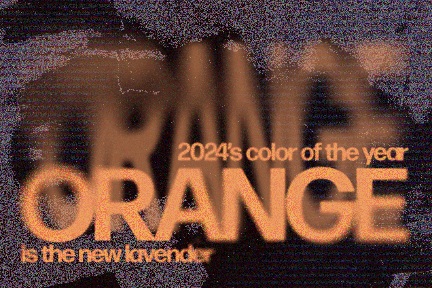
As 2023 wraps up, we are starting to get a glimpse into what 2024 has to offer. In this case, it’s in the form of WGSN and Coloro’s Color of the Year. Apricot Crush is a peachy orange that is predicted to gain popularity because of its calming effect and multifunctionality, as well as its ability to enhance certain industries.
Apricot Crush is a jovial option that can be thought of as more than just a color. Consumers are projected to be allured by this warm and refreshing hue to combat the uncertainty of the future. Consumers are also expected to prioritize health and wellness. Apricot Crush reminds us that the nutritional benefits of oranges and apricots are not only physical but spiritual mood lifters which is why customers are gravitating towards it. This color, in some cultures, represents beauty in nature, specifically referring to the orange pigments of clouds in a sunset.
The first introduction to Apricot Crush dates back to F/W 21/22. As the name suggests, Peachy is a true peach. A year later in F/W 22/23, we see a deeper peach color appropriately named Faded Citrus. Then in S/S 23, a bright orange called Papaya Smoothie debuted, and darkened to evolve into the F/W 23/24 and S/S 24 color Apricot Crush.
For the past three years, orange has been a consistent color on the runway. Predicted for F/W 23/24, Apricot Crush will have an impact on the European market and expand both globally and across various industries by 2024. Due to its gender-neutral and multi-seasonal charm, orange has been growing in popularity. In the S/S 22 and F/W 22/23 runway shows, one of the top five colors of those seasons was orange. There was a thirty-four percent increase in S/S 22 and a fifty-five percent increase in F/W 22/23.
Many artists and brands of different industries have already been integrating this color into their work. Howard Phillips, a 3D artist and designer, creates digital environments that utilize abstract elements. Sean Wotherspoon, designer and artist, collaborated with Porsche for the Porsche Unseen collection. The car integrates this shade of orange, blue, and green which gives it a whimsical demeanor. Another brand implementing this color is Tyler, the Creator’s brand Golf le Fleur*. Golf le Fleur* released nail polishes intended to push gender norms. Georgia Peach, the polish that uses the orange hue, is lively and works for any skin color, age, or gender.
Pairing Apricot Crush with certain colors will help cultivate different emotions, while also helping advance certain platforms. Coupling Apricot Crush with lavenders, mauves, and yellows will create an inviting aura that gives the illusion of a glowing color palette. This color palette is best fit for a younger audience, thanks to it’s gender neutrality, and use for digital platforms. For a more warm and refreshing palette, partner Apricot Crush with sages and mints. This swatch is versatile and can be used across many industries.
Apricot Crush is an energetic shade of orange that has a deeper meaning and even has a cultural significance. The hue has been developing for years, and the color orange has been making an impact on the runway internationally. Artists have already started to apply this color to their pieces while using it very intentionally. Apricot Crush comes at a time when bright and optimism is lacking and will surely help revitalize both the runway and our lives.
Words by Maddie Reynoso.
Graphic by Evan Skovronsky.