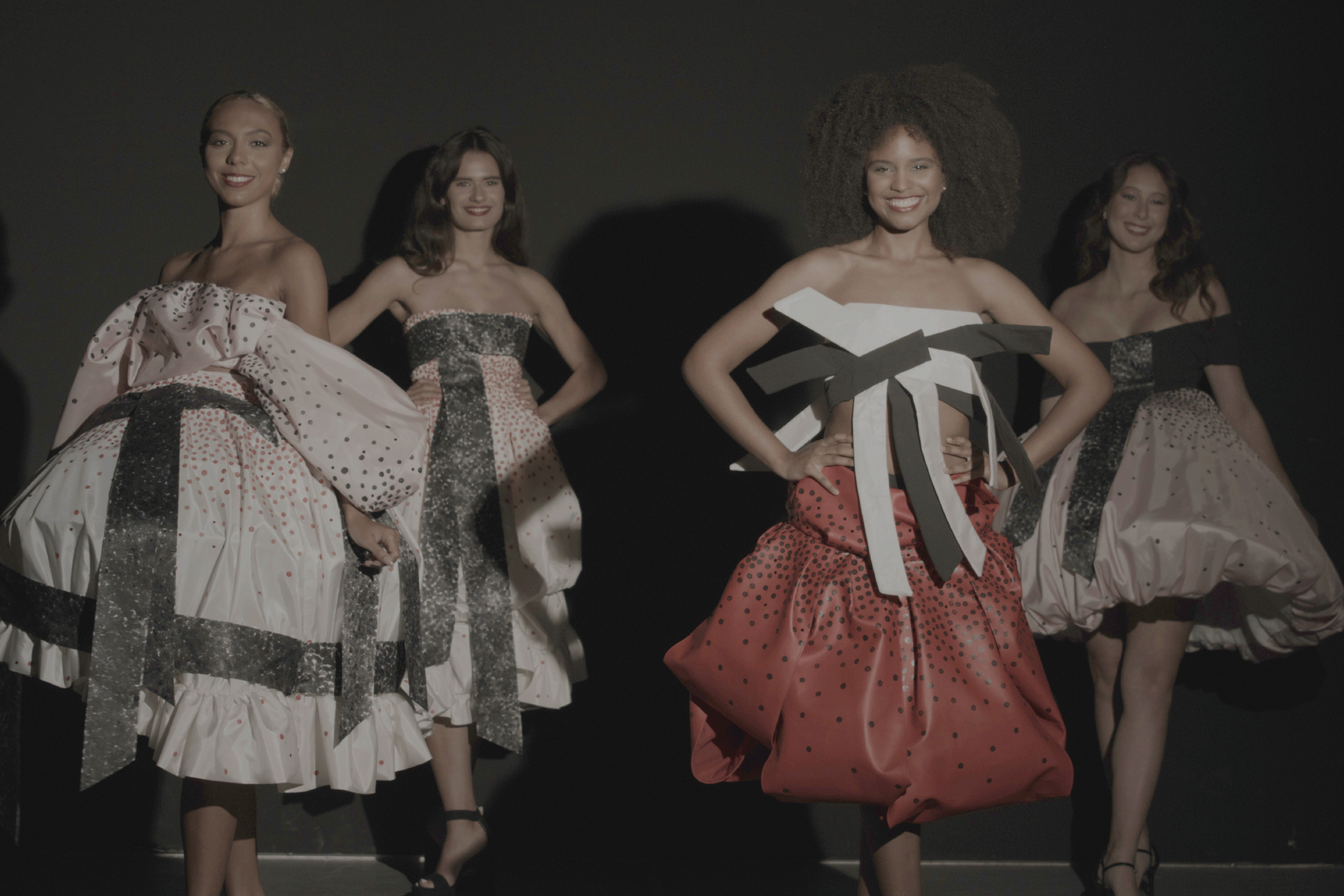
Your senior collection is titled “Marcia Marcia Marcia.” Can you tell me a little about what it’s about?
It’s about my grandmother, and I chose her because she was a really interesting lady. She had a really cool life for a young adult. She was in beauty pageants, which is the main theme, but she did a lot more too. She was a showgirl in Reno and was the mom to my dad. She was a really talented oil painter too, but she suffered from really really severe OCD. She hid it really well until her decline. She passed when I was 5, I think she was only like 65 which is sad because it really took over her life. I thought it was an interesting parallel that she was in such a toxic environment with beauty pageants and also she had OCD. It’s an interesting coincidence and I wanted to explore that.
What was your ideation and development process like once you had that concept?
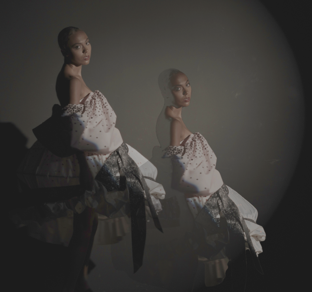
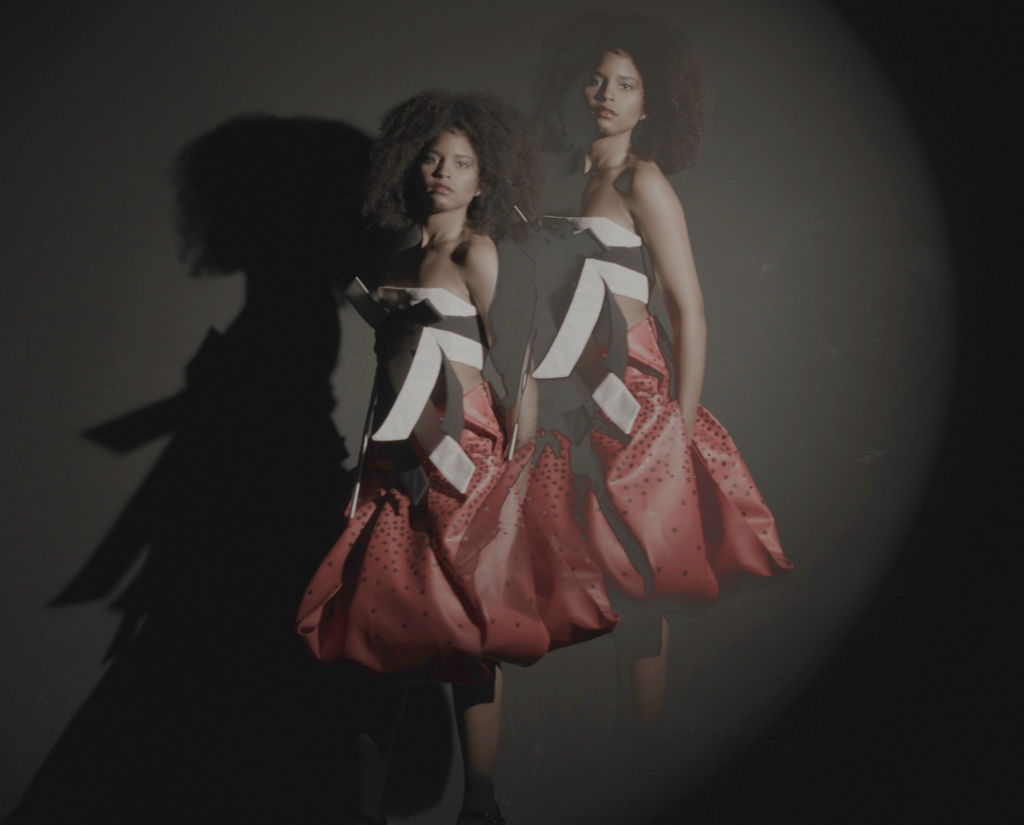
I was initially thinking about repetitions. OCD is doing things over and over again a thousand times. I wanted to showcase that, but I wanted to have that 1950s beauty pageant aesthetic, but also have it be blown up and sort of crazy. I was thinking about how chaotic it is to be super feminine because there’s so many different standards. It’s kind of a mess if you think about all the things you have to remember. I was thinking about big silhouettes because she didn’t like being touched and I wanted to showcase that in some way. I was also thinking about pageant sashes a lot, so I included actual pageant sashes into the collection. At first I was just using pageant sashes but it needed another element which is where the dots come in which were inspired by Yayoi Kusama’s work.
How did you discover Kusama’s work and why did you choose her?
I knew about her previously. My professor told me to bring in some other sort of inspiration for the designs and I was drawn to the dots and colors in her work. She’s also mentally ill and has an obsession with dots which is kind of why I chose her.
What is the meaning behind your color scheme?
The colors I used are red, black, pink, and white. I knew I wanted to use red and black because they were Marcia’s favorite colors. All she wore was black with a little bit of red. Then pink and white I thought complimented those colors and represented that femininity.
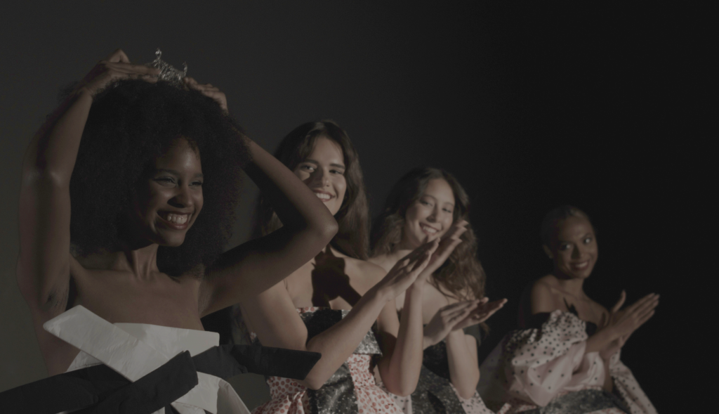
Speaking of femininity, a main theme of your work is the “Chaos within Femininity”, how did you come up with that and how did you want to represent it in your designs?
I just wanted it to be chaotic, so there’s a lot going on. I ended up toning it down a lot but there’s these big silhouettes, dots everywhere, sashes flying everywhere, I just wanted it to be a lot and very maximalist. I came up with it as I was developing ‘Marcia Marcia Marica.’ A big part of senior fashion design classes is uncovering more ideas and things you can add to your concept and designs. I was thinking about ways to describe what I want to showcase on a broader spectrum.
Do you have any advice for the next group of senior fashion design students?
Good luck. It’s really hard; I’ve never worked so hard on anything in my life. It’s worth it though. Also just work smarter not harder, be aware of what little time you have and what you can realistically accomplish in that time.
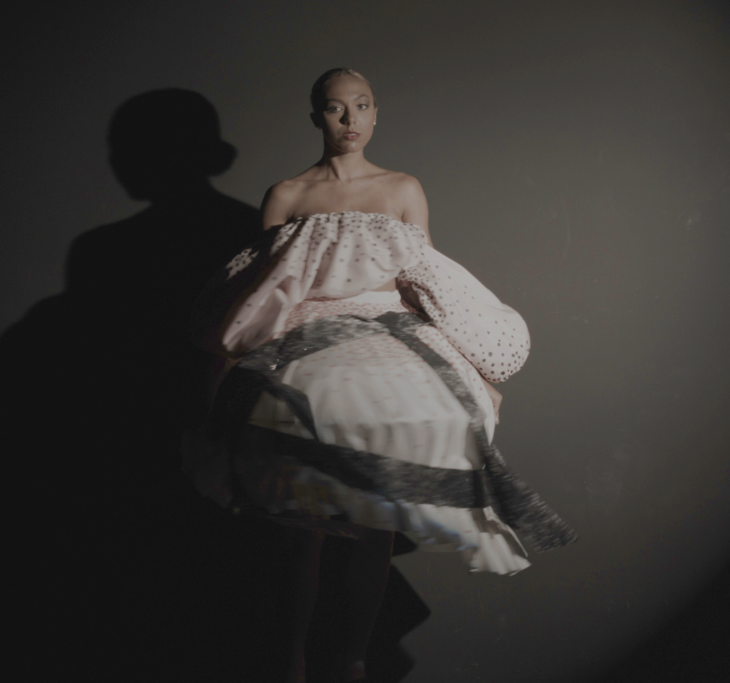
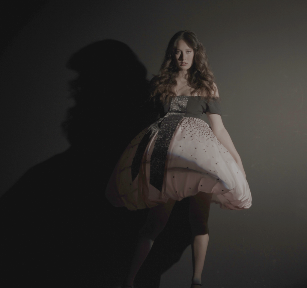
Congratulations to Kelly Kapp and best of luck to her in her future fashion career!
Interview conducted by Alix Russell-Mann.
Photography by Ali Grutchfield.
Talent by Asia Redhead, Maddy Pettigrew, Sam Moyet, and Michela Hendrym.

