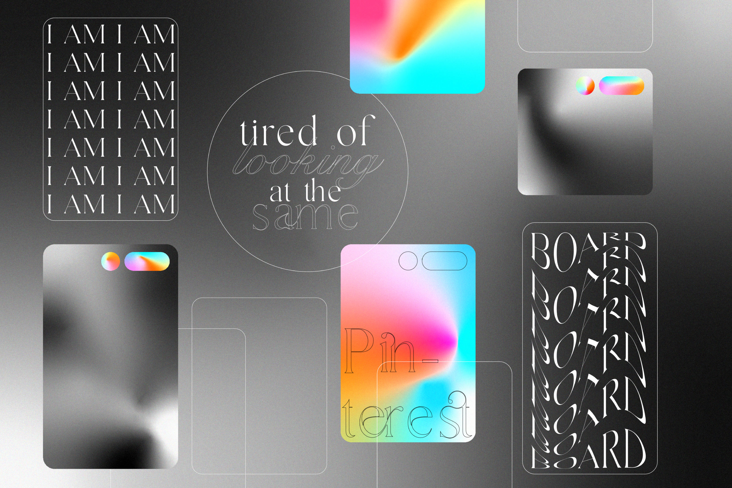
Pinterest has become a part of everyone’s creative inspiration. As art directors, we are tasked with sourcing imagery quickly and precisely, increasingly turning to collective inspiration from websites like Pinterest to locate reference images. Creatives are encouraged to bucket out imagery into thematically consistent folders to be shared and mined by other visitors一 mostly because it is has become unconventional to convey ideas without examples. Although it seems like an endless stream of enticing visuals, the website still ends up looking like everyone’s board, which makes me wonder why this is happening.
Although we tailor our own mood board, Pinterest’s algorithm plays a giant role in controlling what we see and what we don’t. Sounds familiar, doesn’t it? Reference images are considered only by era, subject, or setting rather than as a unified amalgamation of ideas and aesthetics. When these borrowed images are further compiled into the form of art direction mood boards, they’re so ideologically flattened that it’s near impossible to use them as a brainstorming tool for new ideas—they become a rigid road map instead.
Our ideas are greatly shaped by the advertisements we see scrolling through social media, which have also started to look similar. We all are familiar with the art direction style, dubbed “shelfie,” that began with a 1982 Clinique campaign by Irving Penn. Since then, every beauty brand seems to have jumped in on the idea. The glass shelves have a je ne sais quoi attitude, making it feel more seamless.
So, where do we go from here? How do we prevent the repetition of ideas? It may be as simple as looking outside of the world of contemporary graphic design and art direction for inspiration, especially outside the client industry you’re working in, whether by referencing the past or other creative fields. For example: If you’re excited by the idea of reflection, as seen in the cloud-mirror photos, why not see how Ekkehard Altenburger or Yayoi Kusama have played with mirrors in their work?
I know there might be some separation anxiety. After all, Pinterest is also social media, much like Instagram, but I am sure all of us reading this are creatives and at the end of the day., we want to stand out and not be just a part of the pre-existing trends and aesthetics.
The internet can be an asset to research, but a solid concept with fewer examples is always better than an oft-trodden one with a plethora of precedents. Even more simply: trust your intuition. Chances are you’ve absorbed enough of what’s out there visually, even outside of the site, through osmosis alone. Let what you’ve seen filter through the lens of your own memory rather than working directly from a reference on a page? Ultimately, reference imagery should be used as a tool, not a product—leading to visual iteration, not limiting it.
Words by Rhea Gupta.
Graphic by Danna Macias.

