International retailer Zara is infamous for many things, whether it be destroying our planet by being one of the leading fast-fashion brands or always being almost scary up to date on any given season’s most popular trends.
However, something they don’t have is a good website.
When logging onto Zara, flashing graphics, fast-paced video, and giant letters attack you, leaving you with no idea where to go next.
Let’s say you’re interested in purchasing a simple black tank top. Zara’s known for great, affordable basics with a wide variety in shape and color. Your next move would be to click the women’s section, probably go to tops or t-shirts, and scroll until you find what you’re looking for.
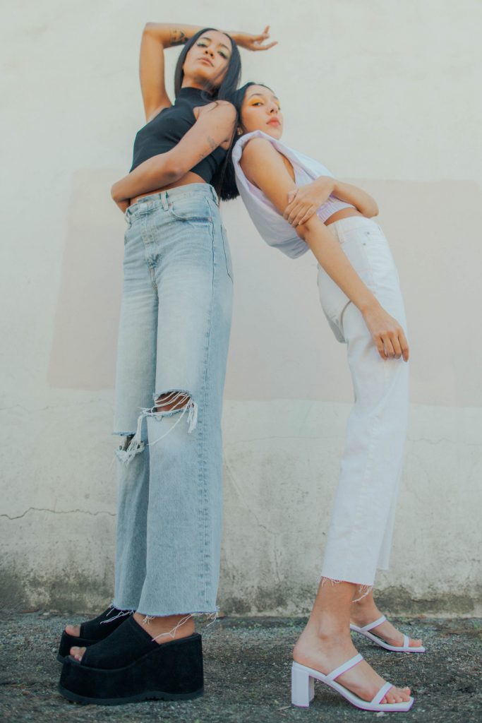
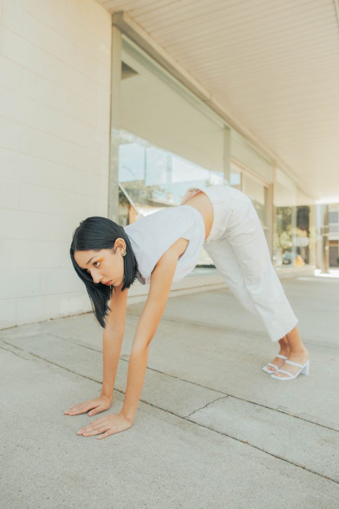
The yoga-like poses they make their models do are almost comical. Zara’s website is a topic of conversation for fashion lovers and shopaholics everywhere. They bond over trying to locate that sheep sweater they saw on TikTok but only find girls curled up on random beds, crouching on the floor, and zoomed-in pictures of faces when advertising a pair of shorts.
Zara’s a great example of brands moving in a more artistic direction with their e-commerce decisions. With the idea of a simple online store now becoming a full-on experience for shoppers, many stores experiment.
One example of a brand that’s taken artistic liberty in a user-friendly yet still aesthetically pleasing way is retailer Pull & Bear. It may be much smaller than Zara; however, their simplistic site allows shoppers to find the exact category they’re looking for, in a still artistic and innovative way.
What Pull & Bear has that Zara lacks is clarity. While Zara’s seems like some cool artistic fashion project, that’s not what you want from one of the leading international retailers. You want to be able to log, be able to navigate their massive selection swiftly and make your purchase. If Amazon can do it with hundreds of thousands of items, they can do it with their graphic knits and wide-legged jeans.
While we love to poke fun at the true gymnastics that is navigating Zara’s website, they continue to come out on top as one of the most successful brands today for the affordable shopper. We’d love to see them putting as much focus as they do their art direction into moving in a more sustainable direction.
Words and Creative Direction by Olivia Hawkins
Photography by Joe Tankersley
Mock Zara Graphics by Olivia Hawkins
Styling by Olivia Hawkins
Talent is Paige Robinson and Julia King


